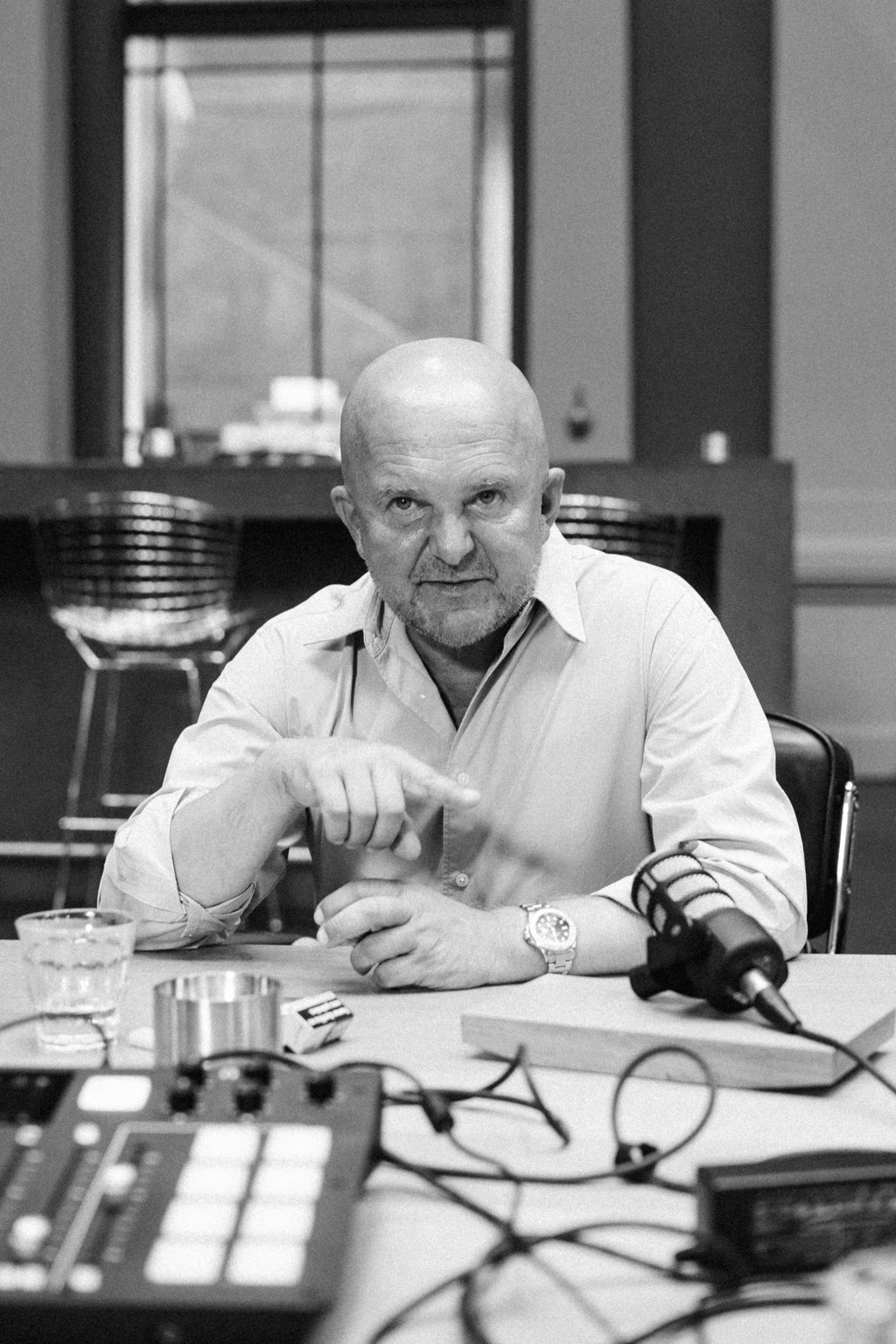
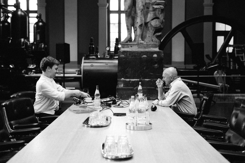
Christian Boros is a businessman and art collector. His communications agency BOROS is responsible for the corporate design since the 2022 Beethovenfest. Steven Walter met him for a chat. At the company’s headquarters in Berlin, they talked about Christian Boros’ passions: collecting art, designing shapes and the work of the agency.
Visual Design with Christian Boros
Breaking out of the orthogonal

»Form is a thought that becomes a structure.«
Forms have fascinated Christian Boros from Cologne all his life. For him, the ability to bring the world into form and make it accessible through form is the central cultural achievement of mankind. As a young man, he immersed himself in the world of art.
»I was very lucky to have been socialised in Cologne – at the right time, in the wild 80s, when Cologne was basically the New York of Europe, where the art scene was buzzing and where I met Martin Kippenberger and Joseph Beuys when I was sixteen. That had an incredible effect on me.«
He started buying art at an early age – his collection has now grown to 100,000 works and is exhibited in a Berlin bunker. Christian Boros sums up his passion for collecting:
»You can buy art, hammer a nail in the wall and hang the picture to brighten up your home. Or you can start collecting. Collecting starts when your home is so full that you buy art that you don’t unpack.«

Beethoven does not fit into any mould
How did the corporate design that BOROS created for Beethovenfest come about? Steven Walter and Christian Boros looked back together.
The task of creating a visual design for a client initially involves a lot of conceptual work. All visual forms must do justice to the message they are intended to convey. For the first draft of the new corporate design at the beginning of Steven Walter’s directorship, Christian Boros held many discussions with his creative designers and the Beethovenfest team.
»If you think designers develop shapes, that’s only the smallest part of the job. Of course a lot of thought goes into it before you materialise something. We thought about Beethovenfest for longer than the time it took to make the shapes. You have to understand that first: What does Beethoven mean, what does he mean today? What does it mean to be an institution of classical music?«
When designing the Beethovenfest, Christian Boros asked himself the question: How classical should classical music be? For him, the answer is this: Only radicalism can enter the canon of classical music. Accordingly, his agency came up with a design that could never be squeezed into the »orthogonal forms« that are so ubiquitous in our culture.
»What made Beethoven so groundbreaking in history? It was his radical approach. That is why I chose the youngest and most radical of my designers to design the Beethovenfest. Not a senior who would chisel the dignity and solemnity of Beethoven in gold and in a wonderful classical font.«
The result is the festival’s graphic logo components, known in the jargon as »visuals«: the two polygons that appear in two colours and ever-changing shapes. They are dynamic and polygonal, never fitting into the frames in which they appear: Visually, they convey the non-conformity and radicalism that made Beethoven immortal. The idea is based on the shaped canvases of Ellsworth Kelly – an American artist who was the first to create art on non-rectangular canvases in the mid-20th century.

»Beethoven would not repeat himself. We have not developed a logo that has a fixed constellation, but have proposed a floating identity. There is a different shape in every given format. It permutates, it is music.«
